Understanding undertones, the colour wheel and combinations — the science behind which shades flatter you and how to build harmonious makeup looks.
Colour theory explains why certain shades flatter your skin and why some combinations look harmonious while others clash. Once you understand undertone, complementary colours and contrast, you can stop guessing and start choosing shades that consistently work for you. It's the secret behind every polished look.
The colour wheel organises colours into primary (red, yellow, blue), secondary (orange, green, violet) and tertiary shades. Complementary colours sit opposite each other (e.g. red and green) and neutralise each other; analogous colours sit beside each other and harmonise. Understanding this lets you correct, contrast and build balanced eye and lip looks.
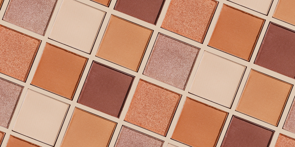
Your undertone (warm, cool, neutral) tells you which colour family flatters you. Warm undertones glow in peach, coral, gold, bronze and warm reds; cool undertones in berry, plum, fuchsia, blue-red and silver; neutral can wear both. Getting this right is the single biggest upgrade to a makeup wardrobe.
Complementary colours cancel each other out — the basis of colour correcting:
Contrast between your eye colour, skin and makeup creates impact. Deeper skin carries bold, saturated colour beautifully; lighter skin reads soft and medium tones well. Eye makeup that contrasts with your iris (e.g. copper on blue eyes, plum on green, navy on brown) makes the eyes pop.
For balanced looks, limit yourself to two or three colour families. A monochromatic look (the same tone on eyes, lips and cheeks) reads modern and sophisticated; a complementary contrast reads bold. When in doubt, a neutral eye with a statement lip — or vice versa — is foolproof.
Colour theory turns guesswork into guidance. Learn your undertone, keep the colour wheel in mind, and use contrast and correction deliberately. The result is a more cohesive, flattering look every time.
Colour theory turns guesswork into guidance. Once you understand undertone, the colour wheel and contrast, you can choose shades that consistently flatter rather than hoping for the best. Warm undertones glow in peach, coral, gold and bronze; cool undertones in berry, plum, fuchsia and blue-red; neutral can wear both. Getting your undertone right is the single biggest upgrade to a makeup wardrobe, and it applies across the full spectrum of South African skin.
Complementary colours cancel each other out — the basis of colour correcting that’s especially useful under the SA sun and for local skin concerns: peach and salmon correctors neutralise blue-purple under-eye circles, orange corrects deeper dark circles on darker skin, green cancels redness from breakouts and scarring. Contrast creates impact — eye makeup that contrasts with the iris (copper on blue eyes, plum on green, navy on brown) makes the eyes pop, and deeper South African skin carries bold, saturated colour beautifully. Limit a look to two or three colour families for harmony, and a monochromatic tone across eyes, lips and cheeks reads modern and sophisticated.